Colours are crucial in your marketing and branding strategy and are something that needs to be carefully and clearly considered. I will attempt to explain why this is in this article and I have attached a very interesting infographic that I came across recently that should give you some food for thought when it comes to the best uses of colour in marketing and branding.
Colours complement design
Good design is paramount in terms of selling things, people are far less inclined to buy things that are poorly designed or look cheap. Colour is the element that adds to the design itself and can really make it pop and it is no coincidence that you like black power banks or portable speakers over their orange counterparts. Colours are so important that companies invest a lot of time and money into getting feedback on colours and finding the right ones for their products, as they know it is a key selling point.
Brand Recognition
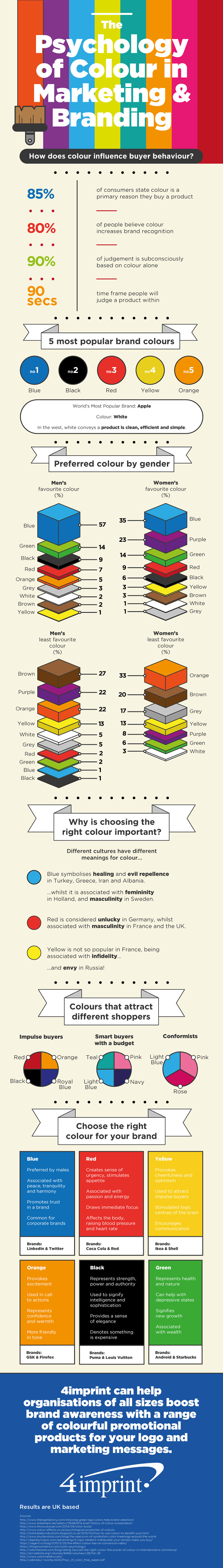
A great example of brand recognition is Coca Cola, because it is one of the most recognisable brands in the world and this is no fluke, they have a very clear colour scheme and their branding is consistent throughout the world. Coca Cola’s branding strategy is crucial in them being the most popular soft drink in the world, they have even trademarked the “Dynamic Ribbon” that appears underneath the logo. Such is the importance and consistency of Coca Cola’s brand that it is known far and wide. Consistency and a visual mix of colours has really built a reputation for the company, as well as a quality product that is enjoyed all around the world.
Consistency
We touched on consistency in the last section, but let’s use Coca Cola again as an example of a brand with consistent use of colour to elevate its branding. Perhaps you have never been on the Coca Cola website, but if you were to guess what colour scheme the website was, you could certainly guarantee that white and red elements would definitely be incorporated. Probably the best example is if you think about Coca Cola advertising, there is never colours that overpower the red or white of the logo. This would be too confusing and detract from the reputation the brand has built with its colour scheme. The same is true for other businesses, they need to be aware of their brand identity and stick with it.